Amazon Quicksight is a business intelligence service within AWS that allows you to quickly create graphs and visualizations from a variety of data sources. In this tutorial we will be using Amazon Quicksight to create an interactive data visualization dashboard from RDS data.
In the previous post, we went through the necessary steps to connect our Aurora MySQL instance to Quicksight through a VPC. This tutorial is a continuation of those steps and assumes you already have a data source with a valid connection to Amazon Quicksight.
Check out the last tutorial for in depth instructions on setting up security groups and permissions for connecting RDS and Quicksight through a VPC.
Connect data source to Amazon Quicksight
Navigate to the Amazon Quicksight main area. Select Datasets from the left-hand menu and click the New Dataset button.
- Give your data source a name.
- Select your RDS instance
- Select the VPC connection. (If this drop down is empty, refer to this previous tutorial for instructions on setting up a VPC connection in Quicksight)
- Enter your database name, username and password. These are the settings used to connect to the actual database on the instance.

Once your connection is validated, click Create data source to see a preview of the tables in your database.

If you just need data from a single table, you can choose the table and click Select. However, if you need to join tables, or format certain data fields before visualizing it, you can select one of the other options:
Edit/Preview data – Takes you to the “data workspace”, a visual representation of the data entities
Use custom SQL – This takes you to an SQL editor where you can write a query to pull out the data that you want.
I will demonstrate both options, but if you’re already familiar with SQL, my recommendation is to choose the custom SQL option, especially if your dataset requires a more complex query.
Option 1: Use custom SQL
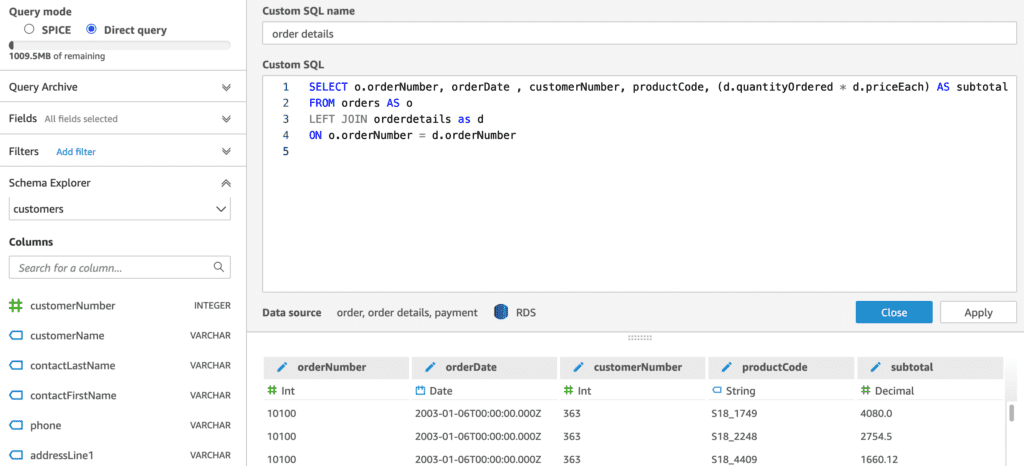
You get an SQL editor with syntax highlighting, as well as a preview of the result data set. You can format data fields, change the column titles in the result and do calculations. There’s also a query archive to see previous versions of the query.
In the top left-hand corner, you’ll notice there are 2 query modes:
- SPICE (Super-fast, Parallel, In-memory Calculation Engine) – stores the data in memory for you so that it doesn’t have to keep querying the database each time you render a visualization. This is a great option for making your visualizations faster, especially for data that doesn’t change quickly. You can set SPICE to refresh and re-query the data on a schedule of your choosing.
- Direct Query is the opposite, which means it will rerun the query each time and get the data directly from the database each time.
Option 2: Edit/Preview Data (data workspace)
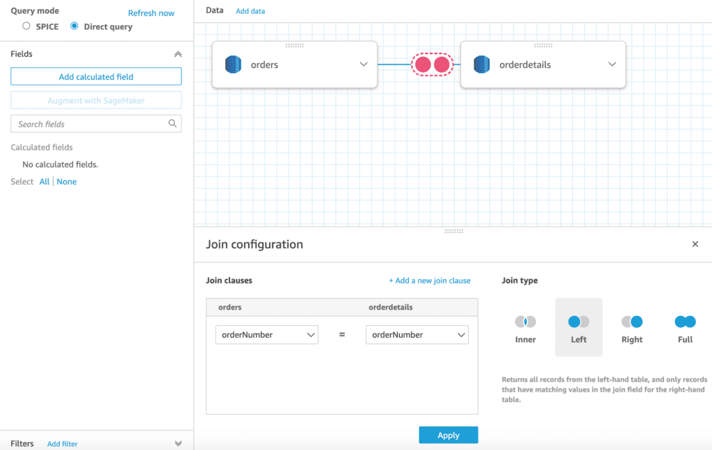
This option offers a “data workspace”, a visual representation of your database tables that provides functions for adding join clauses. This is great for doing simple queries, especially for those who are less familiar with SQL syntax. You can click “Add data” to add additional tables. The only downside of this option is that there’s no way to switch to custom SQL mode for queries created in visual mode. (However, the opposite is possible. i.e queries created in custom SQL mode can be visualized in the data workspace)
Regardless of the option you choose, once you’re happy with your return data set, click apply and you will be taken to the data visualization area.
Create graphs & visualizations in Amazon Quicksight
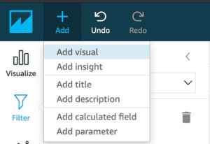
Click Add -> Add visual to create a new visualization from your dataset.
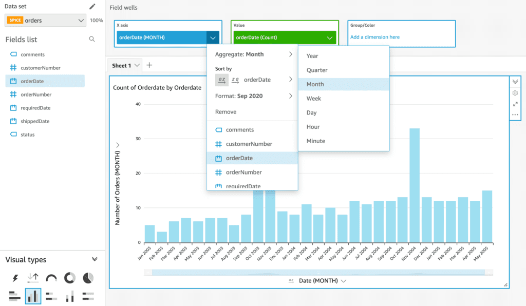
Under Visual types in the bottom left-hand corner, select the type of graph or visualization you want to create. In my example I chose a bar chart.
From the fields list, click the data fields you want to feature on your graph. You can also drag a data field to the X axis (blue) or Value (green) boxes to tell it which axis to use for each field. In my example, I used orderDate and and number of orders per month (orderDate count). The orderDate column consists of individual dates but I can simply use the Aggregate option to group it by month in my graph. You can also format how the fields are displayed (e.g 08/2020 vs Aug 2020) on the axis and edit the titles, colors, etc.
To add additional datasets to graph, click on the pencil icon and add a new dataset. It will take you through a similar process as the first time you created a data set, or you can choose to duplicate your current dataset and then change the query to return a different dataset.
After adding a new dataset, it may take you to a new blank dashboard. If this happens to you, click the Quicksight icon to go back to the main area and select the analysis you were already working on. From there, you should now be able to select your dataset from the drop down and create a new visual from it.
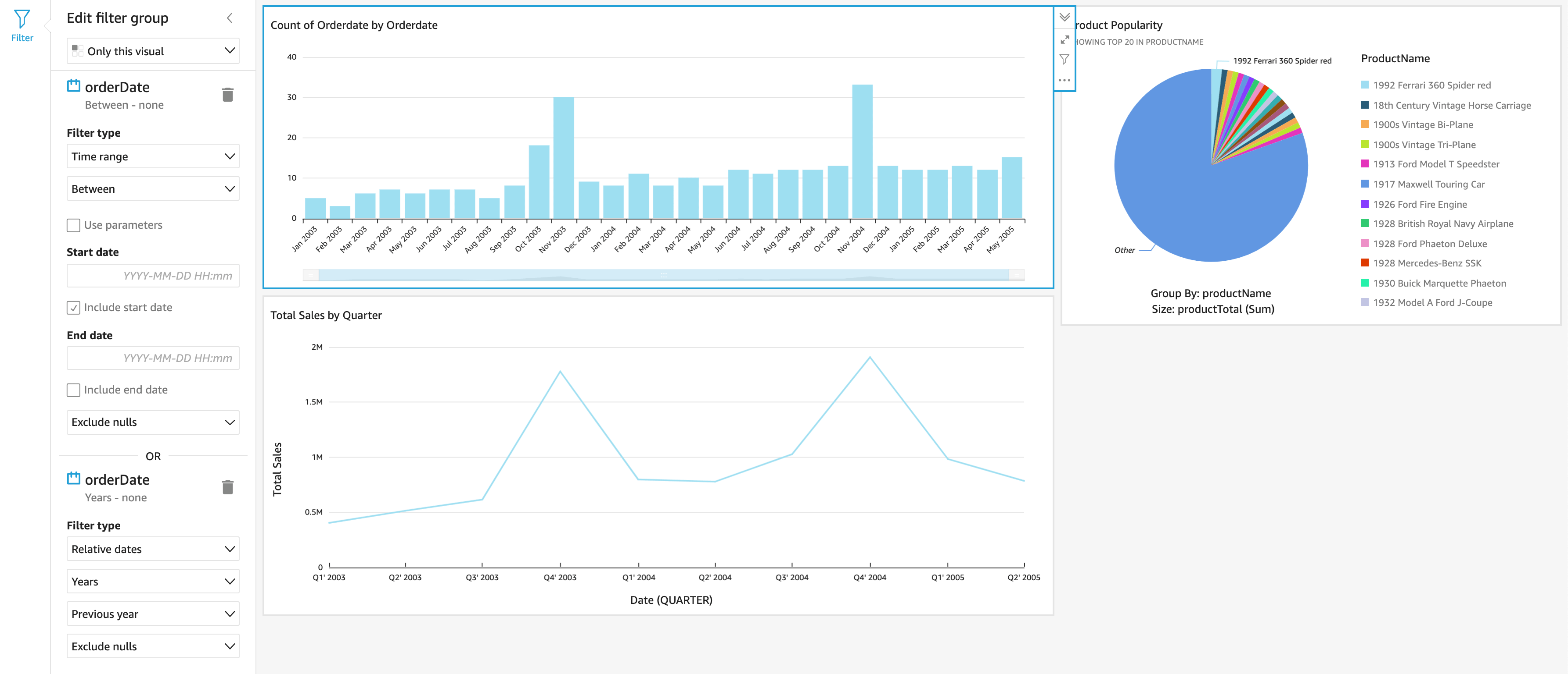
There are also a lot of optional features for making your graphs more interactive. For example, you can create filters that would allow the user to view specific time frames of the data.
Refer to the docs for additional details on some of the other features available in Amazon Quicksight.
Publish a dashboard
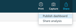
Once you’re done creating your visualizations, click on share from the upper right hand corner and click Publish dashboard. This saves the current state of your dashboard, and allows you to invite others to view it.
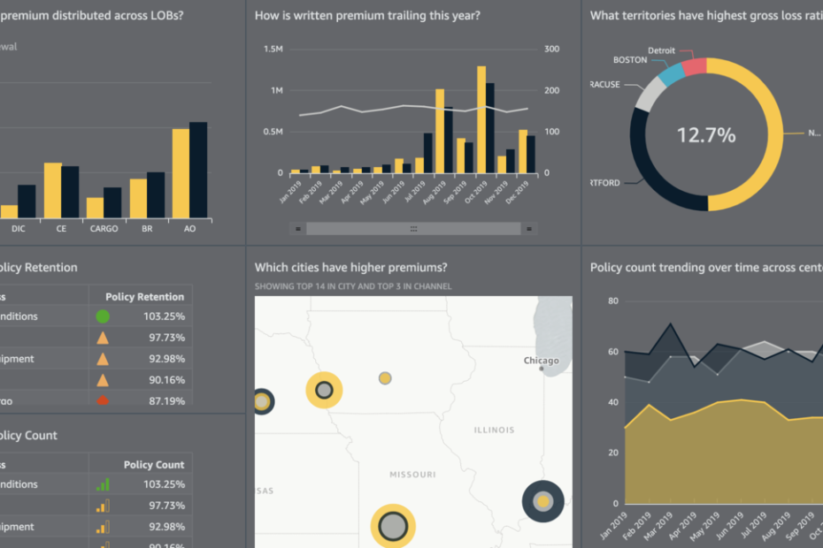
Check out the Amazon Quicksight gallery to see some of the cool visualizations and interactions that are possible!