The AWS Amplify Framework provides a convenient set of tools to connect your application to AWS services such as Amazon Cognito, allowing you to easily set up an authentication flow within your application. The Amplify UI Components toolkit makes it easy to integrate a sign up and sign in flow by providing preconfigured components that you can drop into your application. The login components use Amazon Cognito under the hood and are compatible with a number of frameworks including React, Vue, Angular, Web Components, and React Native.
In this post, we will cover how to customize the default Amplify Login components to add a styled authentication flow to your application. We will use React in our examples but the same principles apply regardless of the framework your application uses. (Note this post assumes that you already have a basic application with authentication setup with Amplify.
Customize Login screen color and styling
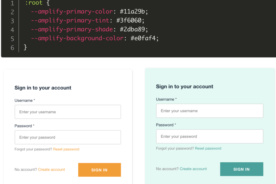
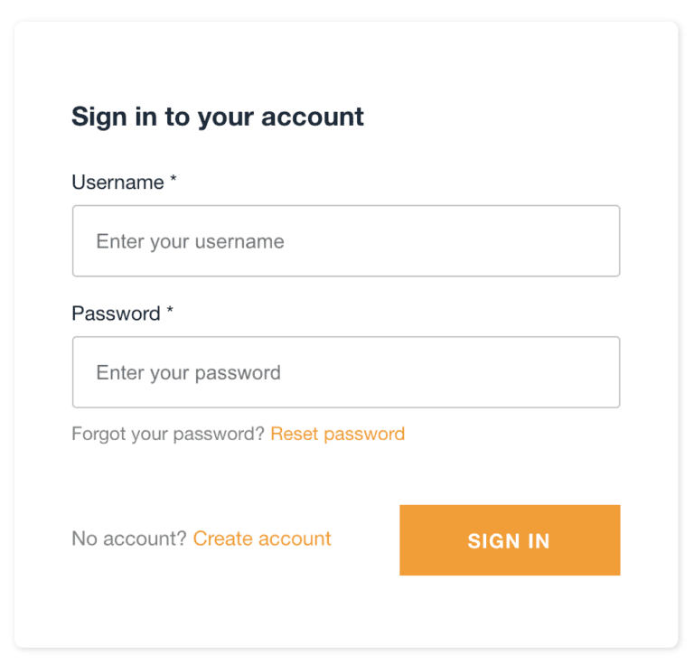
By default, the login screen provided by AWS Amplify comes with an orange button and theme. You can customize the styling by overwriting the CSS custom properties/variables with values of your choice.
Below is a CSS snippet placed in index.css for customizing theme colors that are used for the button color, link hover style and background color of the default Amplify login form. See here for a full list of CSS custom properties you can customize. You can essentially use this list of to create your own theme.
index.css
AWS Amplify Login Form with default orange theme colors
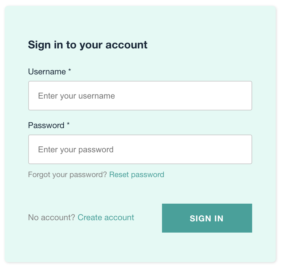
Amplify Login Form with Custom Colors
Hide/exclude fields from the Create Account and Login page
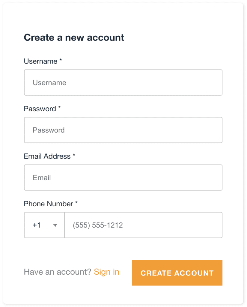
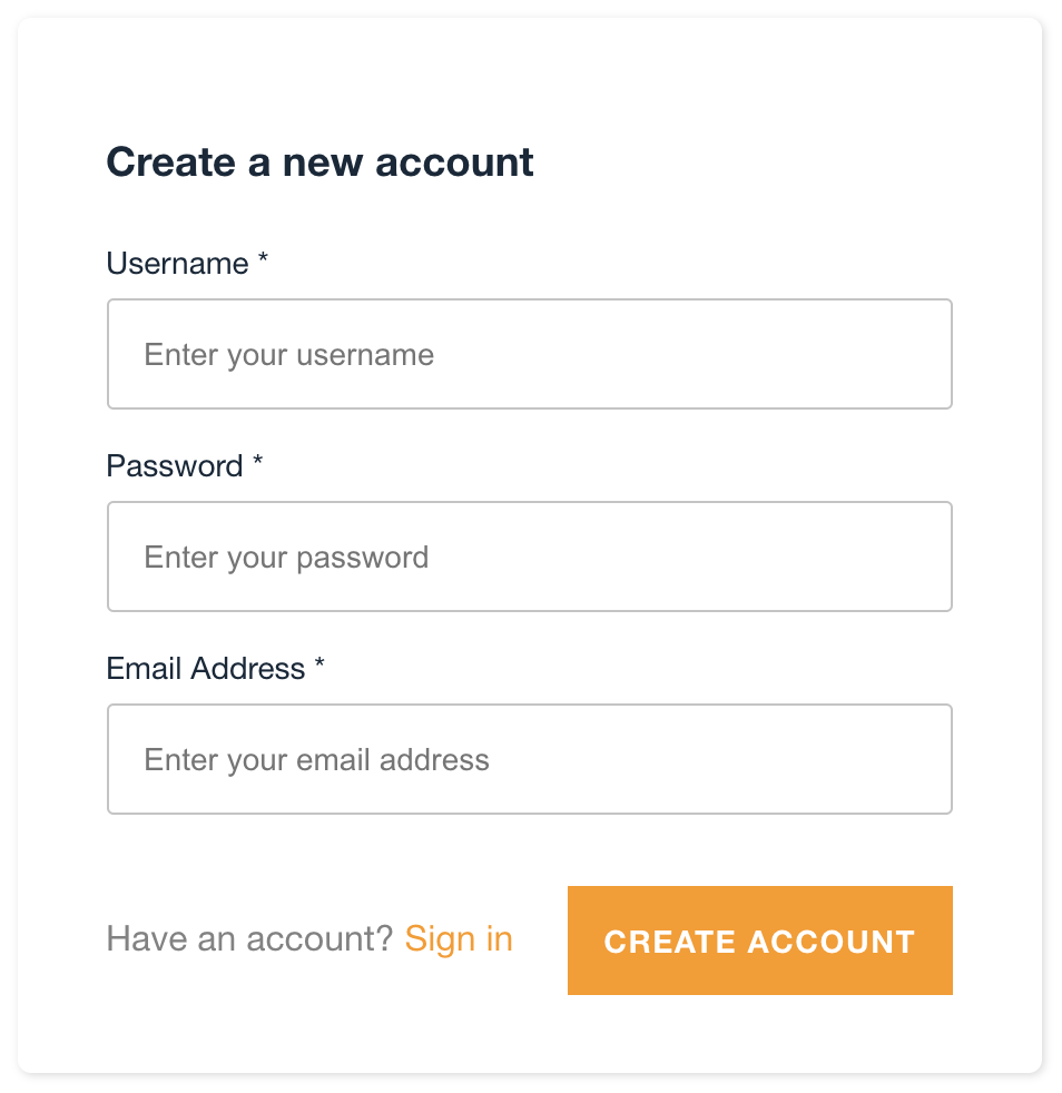
By default, the account creation screen includes fields for username, email, password, and phone number. Depending on your use case, you may not need to include every form field and may want to hide certain fields from your sign up form. Note depending on how you setup your Amazon Cognito User Pool, certain fields may be required.
To control which fields appear in your form, you can explicitly include the AmplifySignUp component and specify only the form fields you want to show. In the following example, we are only including username, email and password and we are excluding the phone number field from our sign up form:
App.js [Line 19-28]
AWS Amplify default "Create Account" screen
Account screen with phone number excluded
Customizing the Amplify Login Screen Text
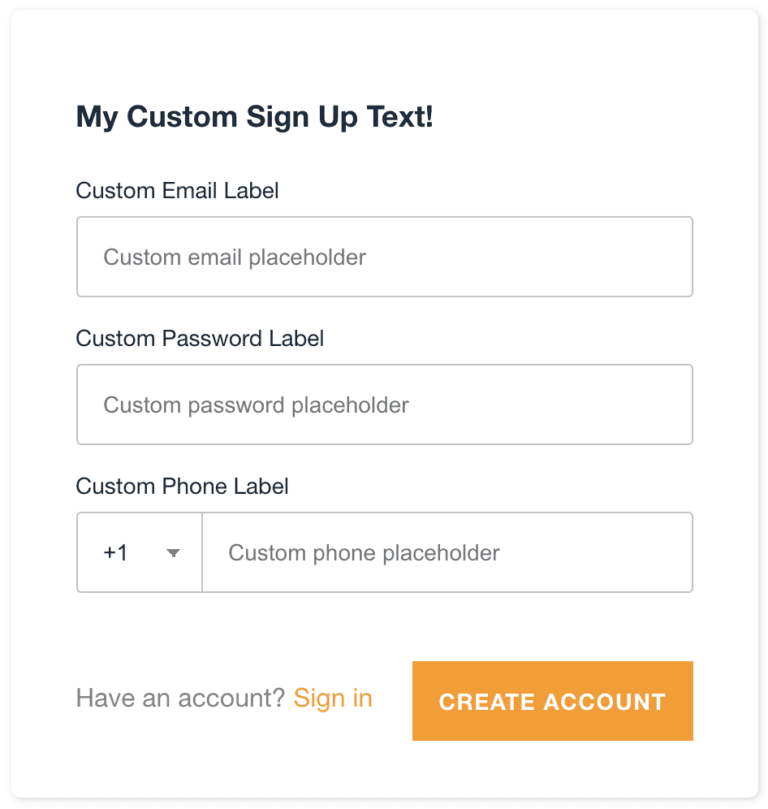
You can further customize the form fields by adding custom label and placeholder text. You can also set field properties and specify whether a field should be required or not.
The form fields’ properties are customized by passing information through the formFields array. In addition to the fields, you can also customize the heading text by setting the headerText property.
Using the Email field for login instead of username
The Amplify login flow is powered by Amazon Cognito which allows users to signup/login by phone number, email or username. By default, it uses the username as the primary login field but you can set it to use the email or phone number instead. In the example above, we’re letting the email serve as the login username so we have to explicitly pass usernameAlias=”email” to each component.
Conclusion
The AWS Amplify UI Components toolkit makes it very easy to integrate and customize a Cognito authentication flow within your application. Click here to read the full documentation for additional customization options.